
Pikkii


How we designed the full product UI in Figma for a UK gifting commerce brand — from browse flows to checkout-ready screens.
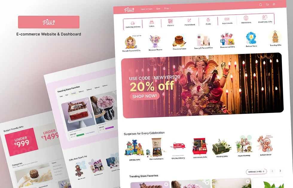
01. Overview
Pikkii is a UK-based lifestyle and gifts brand. They needed a complete product design system in Figma — clear shopping flows, product pages, and a checkout experience ready for development.
Our scope was product UI only: research, wireframes, and high-fidelity screens across the full gifting commerce journey.
02. The Challenge
The brand needed a cohesive product UI before build. Screens felt inconsistent, mobile flows were unclear, and there was no single Figma source of truth for the full shopping experience.
Fragmented UI
Key screens existed in pieces, not as one connected product system.
Unclear mobile flows
Browse, product detail, and checkout needed tighter thumb-first UX.
No design system
Components, type, and spacing were not locked for developers.
Build-ready gap
Development needed annotated, high-fidelity Figma before coding.
03. What We Designed
Phase 1 — UX mapping
Mapped the gifting commerce journey: home, collection, product detail, cart, and checkout. Defined edge cases for gifts, variants, and mobile.
Phase 2 — Figma product UI
Built high-fidelity screens and a reusable component library in Figma — layout, type, colour, and states ready for handoff.
Phase 3 — Handoff polish
Organised frames, naming, and specs so developers could implement without guessing flows or missing states.
04. The Result
- ✓Full product UI covered in one Figma file
- ✓Clear desktop and mobile shopping flows
- ✓Component system ready for engineering
- ✓Checkout and key states designed end to end
- ✓Delivery in 1.5 months from kickoff to handoff